Twenty-seven linen shades can be an invitation to experiment, but they can also make a first order feel harder than it needs to be. Instead of choosing a colour in isolation, use the wardrobe you already own as the starting point. A shade earns its place when it works with the clothes and accessories you want to keep wearing.
There is no universal best linen colour for mature customers. Age does not prescribe beige, pale blue or any other palette. Your existing preferences, the role of the garment and the combinations you can actually make are stronger guides than a list of supposedly age-appropriate colours.
Start with three complete outfits you repeat
Lay out three outfits you genuinely wear, including shoes and a bag. Notice which colours appear repeatedly and which pieces do most of the work. You may discover that a favourite shoe colour connects several outfits, or that one cardigan is the reason a particular shade gets worn often.
Write down the role of the new linen piece. A shirt that needs to work with two existing bottoms asks a different colour question from a dress worn as a complete outfit. A coordinated set can be considered together, but still think about whether you want to separate it into other combinations later.

Create a small comparison group
Choose three possible directions from the linen colour library: one familiar shade, one that coordinates with familiar clothes, and one that feels more adventurous. Compare each with the actual items you plan to wear. Do not keep every possible colour in contention; narrowing the group makes the decision more useful.
For a shirt, place the reference shades beside your trousers or skirt. For trousers, consider the tops and shoes you use most. For a dress, compare the layer, bag and footwear. A colour that looks beautiful by itself but requires several additional purchases may still be worthwhile, but that should be a conscious choice.
Distinguish coordination from an exact match
Two similar shades do not have to be identical to work together. Sometimes a clear contrast looks more intentional than a near-match. If exact matching is important, explain that to the studio and ask what fabric information or confirmation is available. A screen image alone is not a physical colour standard.
Lighting and display settings can change how a shade appears. Product photographs show a garment in a particular setting, while a swatch helps compare the fabric direction. Use both, and avoid assuming that a colour name from another retailer means the same shade. Names are useful labels, not universal specifications.
Think about underlayers and coverage
Colour is only one part of opacity. Weave, weight, construction, lining, lighting and what you wear underneath can all influence the result. Do not assume every white garment needs a slip, or that any dark shade guarantees complete coverage. Ask about the particular fabric and design if this matters for your use.
Include the underlayer in your outfit test. A top that coordinates from the outside may reveal a contrasting layer you did not intend to show. Conversely, a deliberate underlayer can be part of the look. The important point is to decide before ordering, rather than discover that the outfit needs a new foundation garment afterwards.
Consider how much colour you want in the outfit
You may prefer a quiet base with a colourful accessory, or a strong linen shade with familiar neutral shoes. A tonal group can make separates feel connected; contrast can make one piece the focus. Neither direction is more appropriate for a particular age.
If you are uncertain, use the proposed colour in the garment role with the clearest existing partners. For example, a first linen shirt may be easier to judge if it works with two trousers you already like. That is a practical reason to start small, not a rule that your first purchase must be conservative.
Check the decision against the real calendar
Ask where you expect to wear the piece in the next few months. An occasion shade may be a good choice if the event matters, while an everyday colour may offer more repeated use. Do not let a theoretical capsule wardrobe overrule a colour you enjoy and have a real plan for wearing.
Before confirming, record the selected shade, garment and intended combinations. If ordering made to measure, note that LINENELLAR’s 20% surcharge concerns the selected product price and fit route; it does not make every design change automatic. Discuss fit and colour as separate decisions.
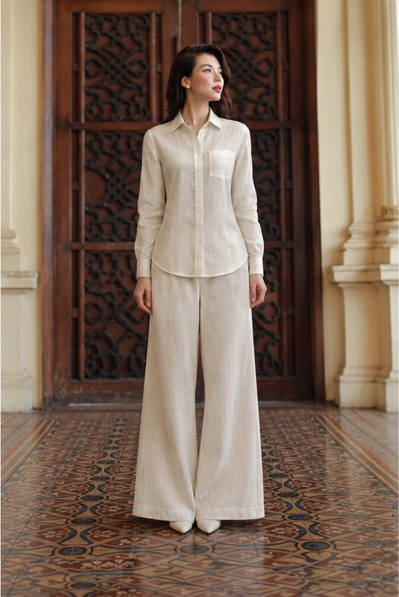
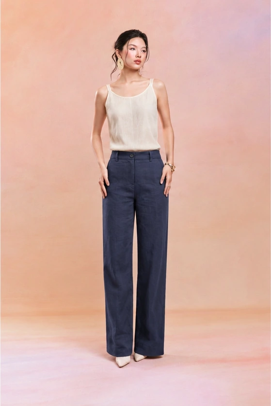
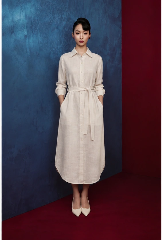
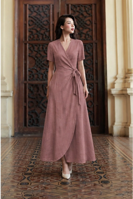
The pieces below offer different ways to introduce a first linen shade. Use their photographs as design references, then choose your fabric through the available options. The most useful first colour is the one that joins your wardrobe with a clear purpose and leaves you looking forward to wearing it.
Continue reading
Pieces to explore
Three designs to compare with the ideas in this article. Open each product for current pricing, available choices and construction details; confirm any requested fit or design change with our studio.